Context
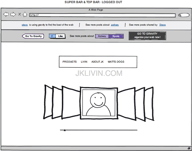
Gravity launched into the early social web with a contrarian idea: organize people by interests, not friend lists. Before the feed swallowed everything, Gravity wanted to be a technology newspaper you could talk back to — a conversation network mapped onto an “interest graph.” The brief covered the whole identity: logo, brand, and the product UI itself.
The hard part was making something abstract — an interest graph — feel like a place. People needed to land, understand “this is about the things I care about,” and start a conversation in the same breath.
Approach
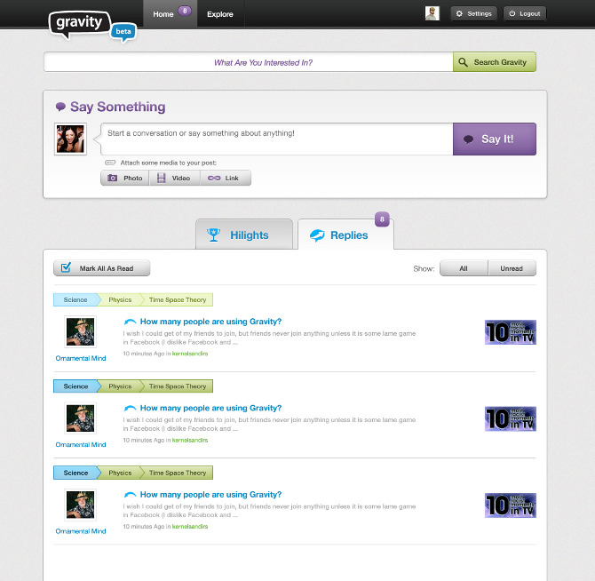
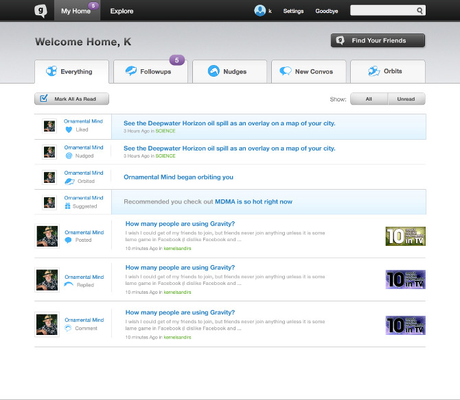
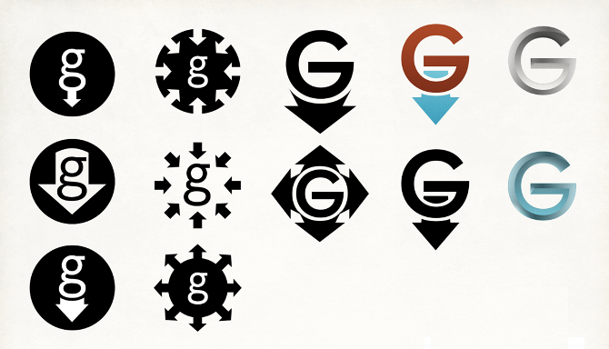
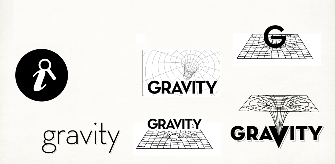
We built the identity around a single mark — a speech bubble with gravity, the pull of a good conversation — and ran it through dozens of iterations before settling on the v1b logo. The product followed the same logic: a prominent “What are you interested in?” bar up top, a “Say Something” composer, and threaded replies tagged by topic, so the interest graph was always visible in the structure.
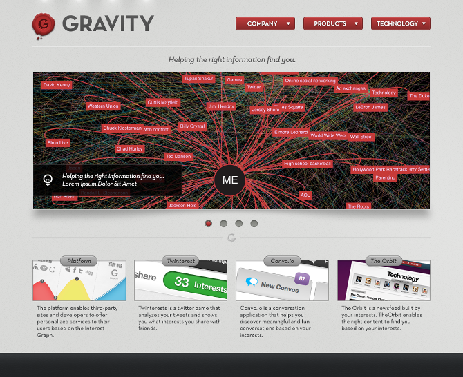
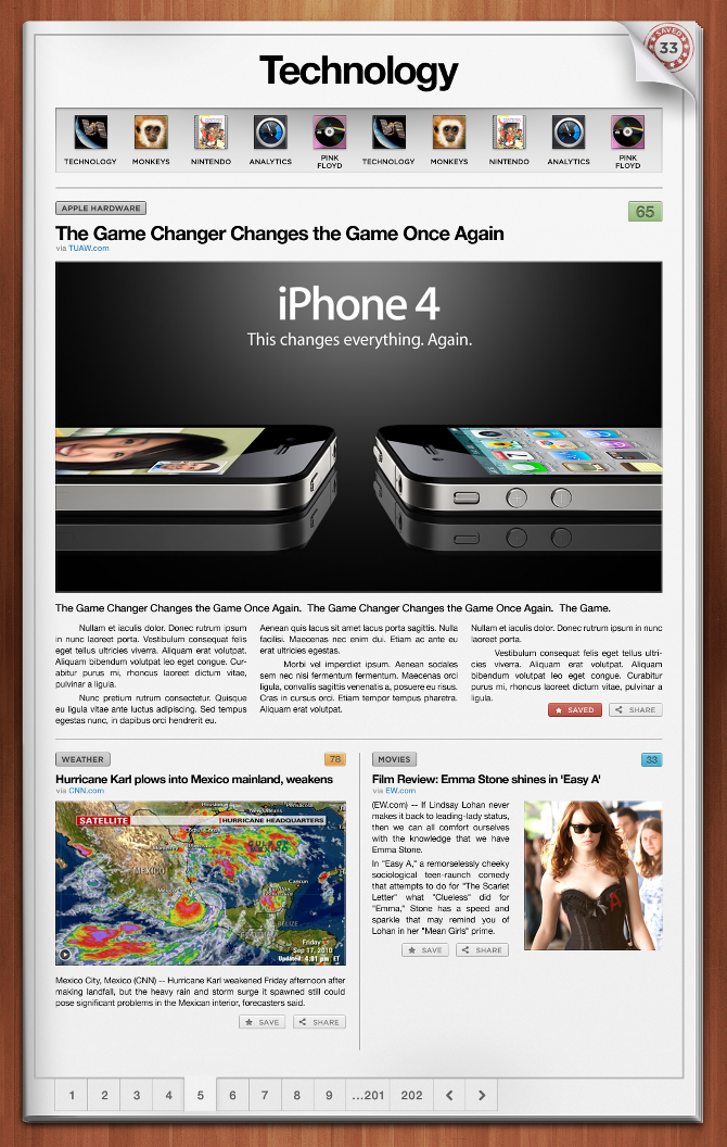
Alongside the app we designed the data visualization for the interest graph itself and a set of marketing pages, keeping one warm, slightly editorial system across print and screen.
Outcome
Gravity shipped as a branded conversation platform with a full identity, a redesigned landing page and user home, and an interest-graph data viz — an early, optimistic take on social organized around curiosity rather than connections. It's a time capsule from 2010, and a clean example of taking a concept the whole way from logo sketch to working product.
The interest-graph personalization at its core proved the thesis: AOL acquired Gravity in 2014 for $90.7M, folding the technology into its content-personalization stack.